AMAZING WORK
AMAZING WORK
AMAZING WORK
Here are some of my latest projects
Let's make something da bomb together!!!
Here are some of my latest projects
Let's make something da bomb together!!
WEBSITE
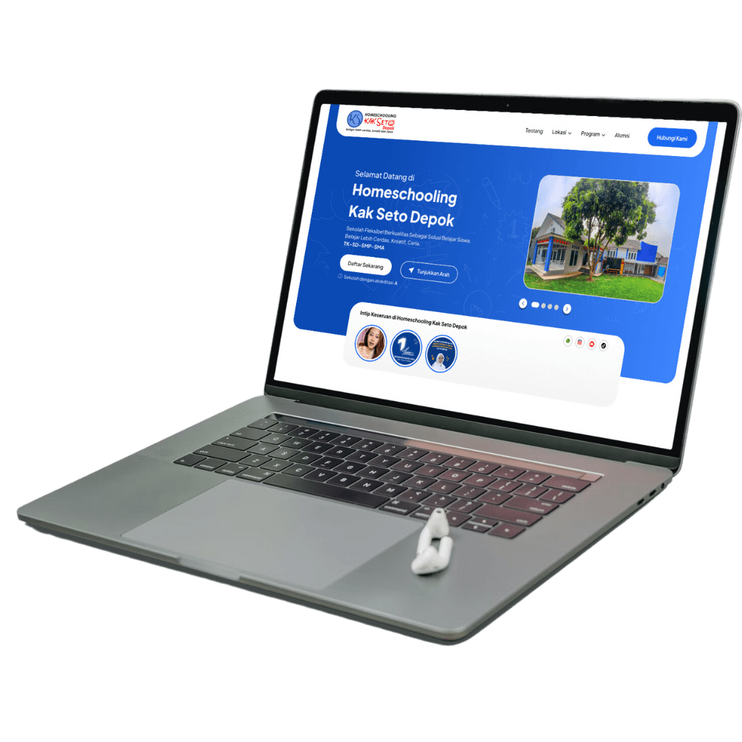
HOMESCHOOLING KAK SETO
WEBSITE
HOMESCHOOLING KAK SETO
WEBSITE
HOMESCHOOLING KAK SETO
OVERVIEW
OVERVIEW
OVERVIEW
Homeschooling Kak Seto is a non-formal education institution in Indonesia that provides personalized learning programs for students from elementary to high school levels. As a web designer, I was tasked with redesigning their official website to enhance its usability, modernize its visual appeal, and ensure it effectively communicates their values and educational services. The goal was to create a responsive, user-friendly platform that serves both prospective and existing students, as well as their parents, while showcasing the institution's credibility and professionalism.
Homeschooling Kak Seto is a non-formal education institution in Indonesia that provides personalized learning programs for students from elementary to high school levels. As a web designer, I was tasked with redesigning their official website to enhance its usability, modernize its visual appeal, and ensure it effectively communicates their values and educational services. The goal was to create a responsive, user-friendly platform that serves both prospective and existing students, as well as their parents, while showcasing the institution's credibility and professionalism.
Homeschooling Kak Seto is a non-formal education institution in Indonesia that provides personalized learning programs for students from elementary to high school levels. As a web designer, I was tasked with redesigning their official website to enhance its usability, modernize its visual appeal, and ensure it effectively communicates their values and educational services. The goal was to create a responsive, user-friendly platform that serves both prospective and existing students, as well as their parents, while showcasing the institution's credibility and professionalism.
CHALLENGE
CHALLENGE
CHALLENGE
The visual design needed to reflect a modern and professional look, appealing to both parents and students while staying aligned with the institution’s branding.
Organizing a large amount of diverse content—such as program details, FAQs, and registration forms—into an intuitive layout was a significant challenge.
Ensuring the website was fully responsive and accessible across various devices, especially smartphones and tablets.
Balancing input from multiple stakeholders, including the academic team, marketing department, and administration.
APPROACH
APPROACH
APPROACH
Held initial meetings with key stakeholders to understand goals, user needs and desired outcomes.
Analysed feedback from parents and students to identify issues and expectations regarding website navigation and functionality.
Reviewed websites of similar institutions assisted by the Product Management team to gain insight into industry standards and best practices.
Created wireframes to map out the website structure and navigation flow for review and feedback.
Designed high-fidelity prototypes with modern visual elements, featuring responsive layouts and intuitive user experiences.
DESIGN PROCESS
DESIGN PROCESS
DESIGN PROCESS
Redesign process began with in-depth discussions with stakeholders to identify the website's key objectives and target audience needs. Insights from user research brokered by the Product Management team guided the creation of wireframes, which served as a blueprint for the site's structure and navigation. Once approved, I developed high-fidelity prototypes that focused on a modern, clean aesthetic that highlighted key content areas, such as programme details and registration options.
Iterative feedback sessions with stakeholders ensured the design was refined to meet expectations. The responsive design was thoroughly tested to ensure a seamless experience across devices. Last the final stages were approved, the design was handed over to the development team.
RESULT AND CONCLUSION
RESULT AND CONCLUSION
RESULT AND CONCLUSION
The redesign of the Homeschooling Kak Seto website was a resounding success, achieving a 95% satisfaction rate based on stakeholder feedback and user testing. The revamped platform now offers an intuitive navigation system, modern aesthetics, and seamless responsiveness across all devices.
The project underscored the importance of collaboration, iterative feedback, and user-centric design in achieving optimal results. By addressing key challenges and aligning with the institution's goals, the redesigned website not only improved functionality but also reinforced the professionalism and credibility of Homeschooling Kak Seto. This success further validated the value of a thoughtful, design-driven approach in creating impactful digital experiences.
OVERVIEW
OVERVIEW
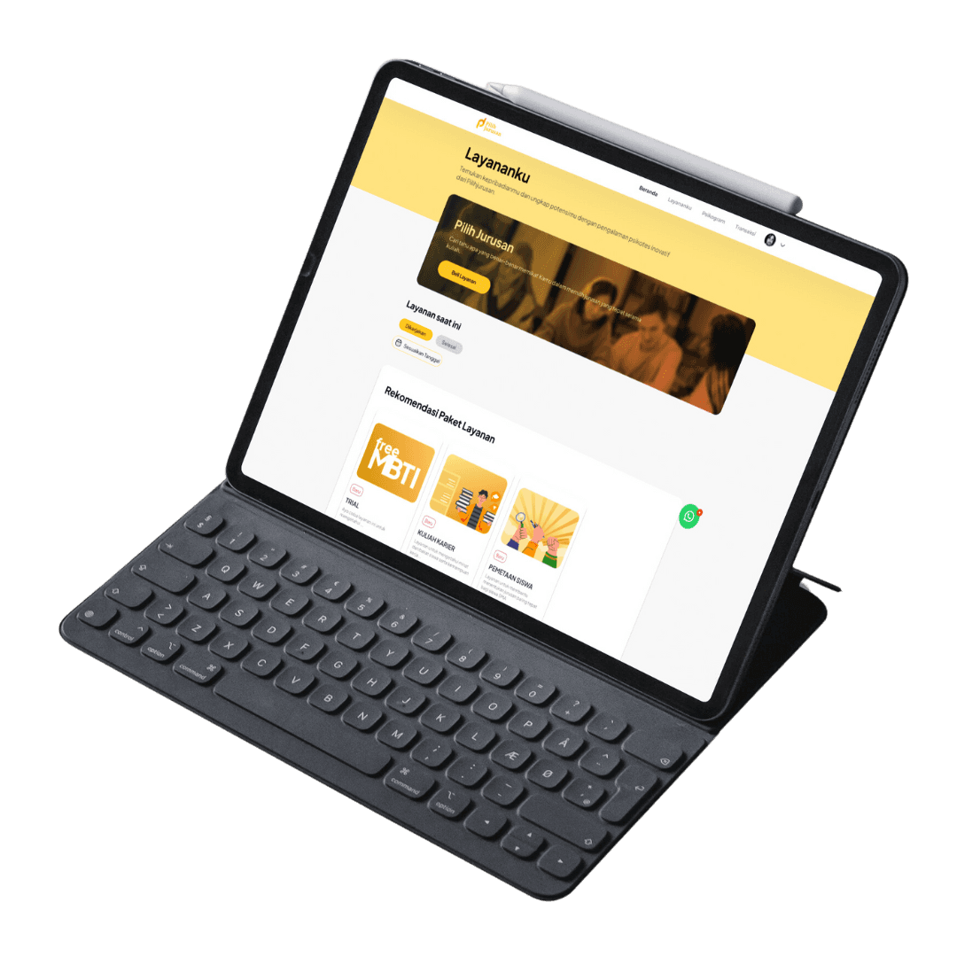
Pilih Jurusan is an educational platform designed to assist students in choosing the right college major or field of study based on their interests, talents, and potential. As a web designer, I was responsible for redesigning the website and integrating new features to improve user experience. The redesign aims to give the website a modern look, improve navigation, and introduce new services such as a student aptitude interest test and an interactive student guide to choosing a career college major.
Pilih Jurusan is an educational platform designed to assist students in choosing the right college major or field of study based on their interests, talents, and potential. As a web designer, I was responsible for redesigning the website and integrating new features to improve user experience. The redesign aims to give the website a modern look, improve navigation, and introduce new services such as a student aptitude interest test and an interactive student guide to choosing a career college major.
CHALLENGE
CHALLENGE
Designing a seamless interface for new services without disrupting the layout of existing content.
Simplifying the user journey to help students easily find relevant information and access new features.
Maintaining a visually appealing design that remains aligned with the functional requirements of the education platform.
Coordinated with education experts, and product management, marketing, and development teams to ensure design alignment with platform vision.
APPROACH
APPROACH
Conducted in-depth discussions with the team to understand the redesign goals and new feature requirements.
Studied similar education platforms with the help of the Product Management team to gain inspiration and avoid common mistakes.
Developed interactive prototypes in Figma and refined them through multiple iterations based on feedback.
DESIGN PROCESS
DESIGN PROCESS
The design process begins with understanding the platform's goals and audience through team discussions and direction from stakeholders. Then, analyzing competitor websites with the help of the product management team to find insights for updates and improvements, using these insights, my team and I created initial drawings to explore optimal layouts. Once approved, it continues with creating a system design as a guide in designing the design; after passing through the low-fidelity to high-fidelity product stages, it continues with developing a prototype that combines modern visuals with practical functionality that has been designed for users.
The design process begins with understanding the platform's goals and audience through team discussions and direction from stakeholders. Then, analyzing competitor websites with the help of the product management team to find insights for updates and improvements, using these insights, my team and I created initial drawings to explore optimal layouts. Once approved, it continues with creating a system design as a guide in designing the design; after passing through the low-fidelity to high-fidelity product stages, it continues with developing a prototype that combines modern visuals with practical functionality that has been designed for users.
RESULT AND CONCLUSION
RESULT AND CONCLUSION
The project achieved significant success, with overall satisfaction reflected in internal reviews. The use of design systems in the design resulted in a 25% reduction in inconsistencies across the website, improving visual harmony and usability.
OVERVIEW
OVERVIEW
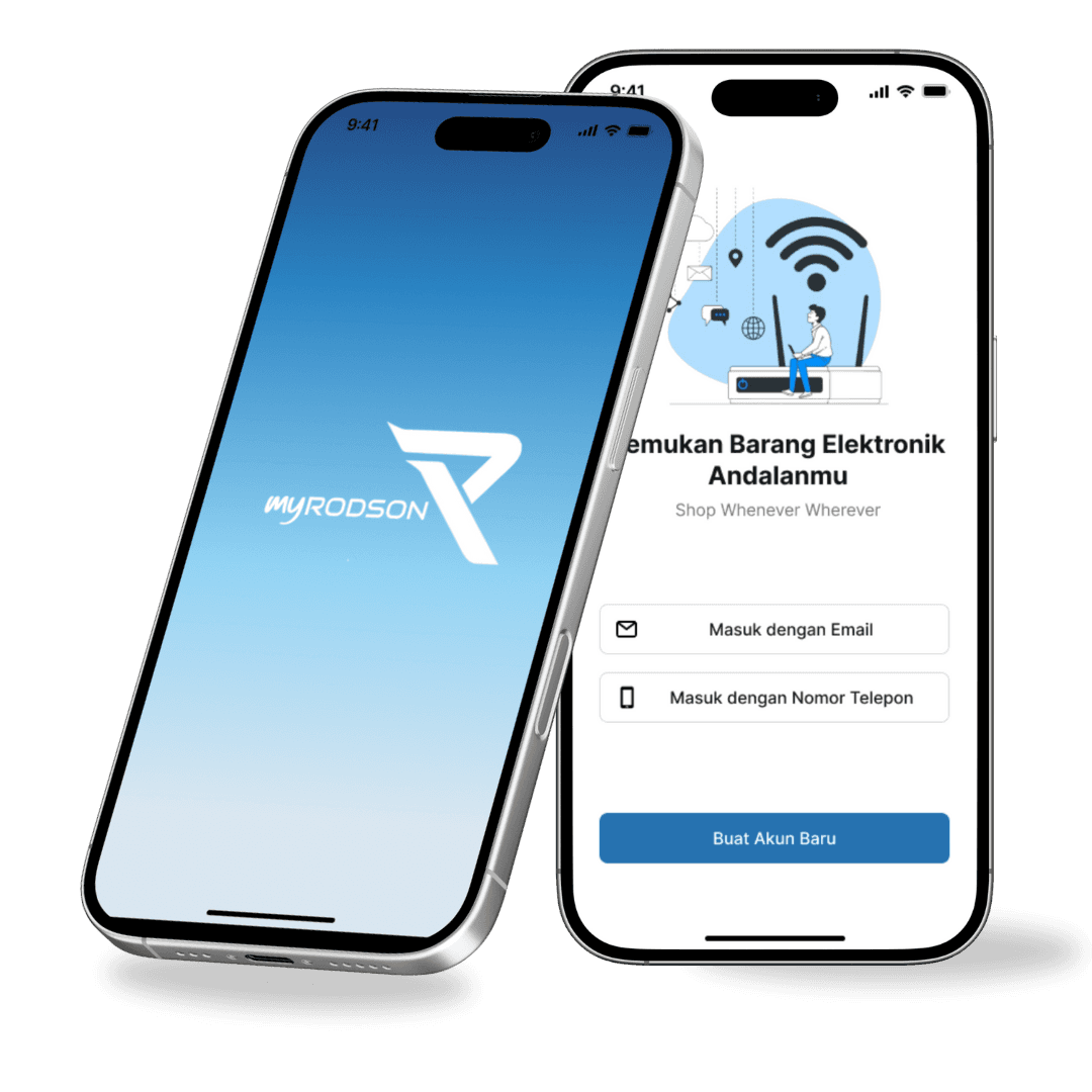
MyRodson is an e-commerce platform that provides a seamless shopping experience for customers looking to purchase a wide range of electronic products. Available as both a website and mobile app, MyRodson aims to offer an intuitive, safe and efficient way for users to easily browse and purchase electronics.
MyRodson is an e-commerce platform that provides a seamless shopping experience for customers looking to purchase a wide range of electronic products. Available as both a website and mobile app, MyRodson aims to offer an intuitive, safe and efficient way for users to easily browse and purchase electronics.
CHALLENGE
CHALLENGE
Understand and implement the client's specific needs and preferences as this is a freelance project. This involves regular communication and adjustments to align with their vision and expectations.Create an intuitive interface that makes it easy for users to navigate categories and find products quickly.
Create a design that is not only visually appealing and user-friendly but also capable of being implemented by the development team. As well as ensuring that the design aligns with the developer's technical capabilities and constraints.
APPROACH
APPROACH
Meetings with clients to find out their desires and needs that need to be implemented,
Conducted surveys and interviews with potential users to understand their shopping habits and preferences.
Analyze other e-commerce platforms to identify strengths and weaknesses.
Created initial wireframes and interactive prototypes using Figma to gather feedback from users.
Conducted usability testing by the quality assurance testing team to improve user experience and ensure the platform is easy to use.
DESIGN PROCESS
DESIGN PROCESS
Began with listening to and interpreting clients' desires, ensuring that their expectations are accurately reflected in the design, conducting comprehensive research and discovery, including user surveys and interviews to understand shopping behavior and preferences, as well as competitor analysis to identify industry standards. Routinely carry out checkpoints with the developer and QA teams
Began with listening to and interpreting clients' desires, ensuring that their expectations are accurately reflected in the design, conducting comprehensive research and discovery, including user surveys and interviews to understand shopping behavior and preferences, as well as competitor analysis to identify industry standards. Routinely carry out checkpoints with the developer and QA teams
RESULT AND CONCLUSION
RESULT AND CONCLUSION
The design for the MyRodson e-commerce project was successfully designed on schedule with the goal of creating a secure and easy-to-use platform for purchasing electronics. With a rating of 85% for client satisfaction
OVERVIEW
OVERVIEW
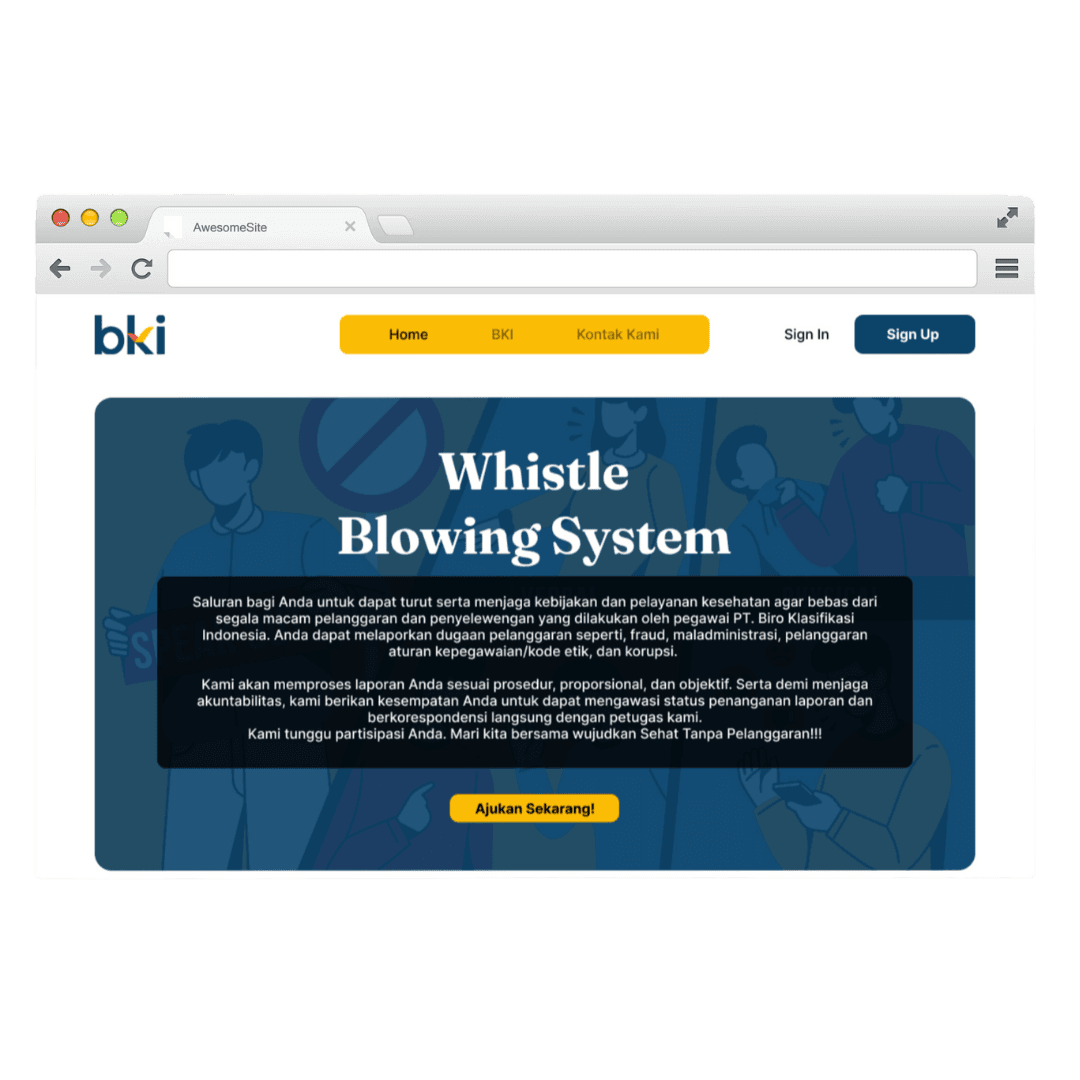
The Whistle Blowing System (WBS) is a platform designed to facilitate the reporting of unethical or illegal activities within an organization anonymously and securely. This system allows employees and other stakeholders to report misconduct, such as fraud, corruption, or abuse of power, without fear of retaliation. WBS plays a crucial role in maintaining the integrity and transparency of the company.
The Whistle Blowing System (WBS) is a platform designed to facilitate the reporting of unethical or illegal activities within an organization anonymously and securely. This system allows employees and other stakeholders to report misconduct, such as fraud, corruption, or abuse of power, without fear of retaliation. WBS plays a crucial role in maintaining the integrity and transparency of the company.
CHALLENGE
CHALLENGE
Creating an intuitive interface so that all employees, including those less tech-savvy, can easily use the system. Ensuring that the whistleblower's data is well-protected and anonymous. And integrating the system with the existing IT infrastructure of the company.
Creating an intuitive interface so that all employees, including those less tech-savvy, can easily use the system. Ensuring that the whistleblower's data is well-protected and anonymous. And integrating the system with the existing IT infrastructure of the company.
APPROACH
APPROACH
Conducting interviews and surveys with employees to understand their needs and concerns regarding
reporting.
Creating initial wireframes to get feedback from users.
Developing a clean and simple interface with easy-to-understand navigation.
Making sure all necessary information is available without compromising the whistleblower's anonymity.
Conducting usability testing with several iterations to refine the design based on user feedback.
DESIGN PROCESS
DESIGN PROCESS
The design process began with team collaboration, focusing on understanding the goals of the whistle blowing system and aligning them with the company's vision and infrastructure. We applied the design thinking methodology to the design process.
The design process began with team collaboration, focusing on understanding the goals of the whistle blowing system and aligning them with the company's vision and infrastructure. We applied the design thinking methodology to the design process.
RESULT AND CONCLUSION
RESULT AND CONCLUSION
The Whistle Blowing System (WBS) project for PT Biro Klasifikasi Indonesia (Persero) successfully provides a secure and easy-to-use platform to report unethical or illegal acts. By implementing end-to-end data encryption, the system ensures the anonymity and protection of whistleblowers. An internal survey revealed that 90% of users found the system intuitive and easy to use, with reports increasing by 40% in the first two months, reflecting high confidence in its security and effectiveness.
The project demonstrated significant results, including increased confidence in reporting, improved operational efficiency in report management, and a positive user experience that encouraged wider participation. Ultimately, the WBS reinforces the company's commitment to transparency and integrity, adding significant value to its reputation.
OVERVIEW
OVERVIEW
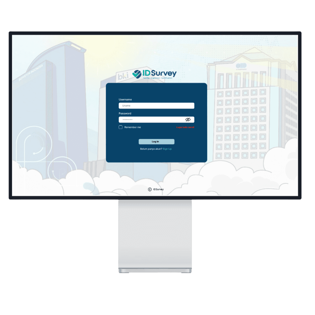
Created a design for the Governance, Risk, and Compliance (GRC) dashboard for ID Survey, encompassing three subsidiaries: PT Biro Klasifikasi Indonesia (Persero), PT Surveyor Indonesia, and PT Sucofindo. The dashboard needed to present critical data from the governance, risk, and compliance departments using various visual formats, including charts, tables, and bars. The objective was to deliver an intuitive and visually appealing dashboard that would facilitate better data analysis and decision-making.
Created a design for the Governance, Risk, and Compliance (GRC) dashboard for ID Survey, encompassing three subsidiaries: PT Biro Klasifikasi Indonesia (Persero), PT Surveyor Indonesia, and PT Sucofindo. The dashboard needed to present critical data from the governance, risk, and compliance departments using various visual formats, including charts, tables, and bars. The objective was to deliver an intuitive and visually appealing dashboard that would facilitate better data analysis and decision-making.

CHALLENGE
CHALLENGE
Create intuitive UI that accommodate the needs of various stakeholders, including department heads and executives.
Ensuring accurate representation and integration of diverse data from governance, risk and compliance departments.
Made several revisions based on feedback from the VP Division, including changes to the color palette and chart design.
Ensure the final design meets the specific requirements of each department, has approval from the division VP and meets the wishes of the board of directors
APPROACH
APPROACH
Hold meetings with representatives from governance, risk, and compliance departments to gather requirements and understand data needs.
Gather and analyze feedback from the VP Division and incorporate necessary revisions into the design.
Developed wireframes and initial prototypes using Figma to visualize dashboard layout and data representation.
Implemented multiple iterations based on input from department heads and Division VPs, refining the UI with each round.
Ensure final mockups are approved by VP Division and aligned with overall project goals.
DESIGN PROCESS
DESIGN PROCESS
The design process began with stakeholder meetings to gather requirements from the governance, risk, and compliance departments. I created initial wireframes to outline the dashboard layout and data presentation. Using Figma, I developed interactive prototypes that incorporated various visual elements such as charts, tables, and bars.
Throughout the project, I received feedback from the VP Division, necessitating multiple revisions to the color palette, chart designs, and overall UI. Each iteration involved refining the design based on stakeholder input, ensuring that the final product met the needs of each department and adhered to the directives from the VP Division
RESULT AND CONCLUSION
RESULT AND CONCLUSION
The GRC Dashboard project for ID Survey successfully delivered an intuitive and visually appealing dashboard that integrates data from governance, risk and compliance departments. The design effectively visualized complex information through charts, tables and bars, enhancing analysis and decision-making. By aligning with departmental needs and incorporating iterative feedback, the project received final approval from the Division VP, for the board of directors, resulting in 33% development efficiency.
The GRC Dashboard project for ID Survey successfully delivered an intuitive and visually appealing dashboard that integrates data from governance, risk and compliance departments. The design effectively visualized complex information through charts, tables and bars, enhancing analysis and decision-making. By aligning with departmental needs and incorporating iterative feedback, the project received final approval from the Division VP, for the board of directors, resulting in 33% development efficiency.

OVERVIEW
OVERVIEW
HOREKAWA is a Point of Sales (POS) application developed for a store owner who previously managed inventory, procurement, and cashier functions using the ZOBAZE app. The client requested a similar application with an upgraded visual design and user experience (UX), while maintaining the familiar layout and flow from ZOBAZE. The goal was to improve user comfort and interaction while retaining the essential functionality of the original app.
HOREKAWA is a Point of Sales (POS) application developed for a store owner who previously managed inventory, procurement, and cashier functions using the ZOBAZE app. The client requested a similar application with an upgraded visual design and user experience (UX), while maintaining the familiar layout and flow from ZOBAZE. The goal was to improve user comfort and interaction while retaining the essential functionality of the original app.
CHALLENGE
CHALLENGE
The primary challenge was to enhance the visual design and UX of HOREKAWA, transforming the minimal and basic interface of ZOBAZE into a more appealing and user-friendly application. This involved:
Visual Upgrade: Ensuring the color scheme, layout, and design elements were more cohesive and aesthetically pleasing.
UX Improvement: Refining the user flow and interactions to provide a more intuitive and seamless experience for both the store owner and their employees.
Feature Optimization: Evaluating and eliminating redundant features, ensuring each element had a clear purpose and improved usability.
APPROACH
APPROACH
Conducting a comprehensive review of ZOBAZE's features to understand their functions and relevance.
Engaging with the client to gather insights on pain points and preferences, focusing on usability improvements.
Creating a cohesive color palette, adding soft radius to elements, and refining the layout to reduce visual clutter and improve readability.
Developing high-fidelity prototypes to demonstrate the new design and gather feedback before implementation.
Ensure the upgraded design met the client’s expectations and enhanced the overall user experience.
DESIGN PROCESS
DESIGN PROCESS
The design process began with a deep dive into ZOBAZE's existing structure to understand its strengths and weaknesses. This was followed by crafting a new visual identity for HOREKAWA, focusing on modern aesthetics and user comfort. The process involved wireframing, prototyping, and iterative testing to ensure the design improvements effectively met the client’s needs. The use of soft colors, better spacing, and rounded elements helped make the interface more inviting and user-friendly.
RESULT AND CONCLUSION
RESULT AND CONCLUSION
The HOREKAWA project is currently in the development stage, with the design nearing completion. The client has provided very positive feedback, expressing satisfaction with 98% of the new visual design and UX improvements. Some additional feature requests were made during the design process, which were incorporated seamlessly. The client's approval of the revamped design underscores the success of this project in creating an improved, easy-to-use POS system that aligns with their vision. The project is on track to deliver a significantly enhanced user experience, setting the stage for a successful launch
The HOREKAWA project is currently in the development stage, with the design nearing completion. The client has provided very positive feedback, expressing satisfaction with 98% of the new visual design and UX improvements. Some additional feature requests were made during the design process, which were incorporated seamlessly. The client's approval of the revamped design underscores the success of this project in creating an improved, easy-to-use POS system that aligns with their vision. The project is on track to deliver a significantly enhanced user experience, setting the stage for a successful launch
OVERVIEW
OVERVIEW
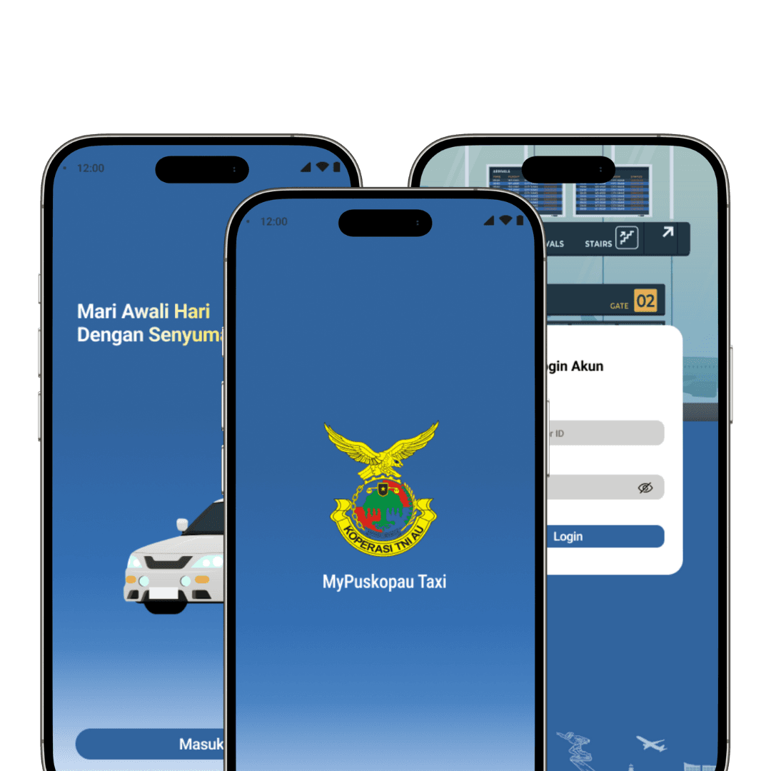
MyPuskopau Taxi is a mobile application designed to digitize the taxi booking process at airports, commissioned by the Air Force Cooperative. This innovative project aims to streamline the way passengers book taxis through dedicated booths available at airports. The application represents a significant leap forward for the Air Force Cooperative, making taxi reservations more convenient and accessible.
MyPuskopau Taxi is a mobile application designed to digitize the taxi booking process at airports, commissioned by the Air Force Cooperative. This innovative project aims to streamline the way passengers book taxis through dedicated booths available at airports. The application represents a significant leap forward for the Air Force Cooperative, making taxi reservations more convenient and accessible.
CHALLENGE
CHALLENGE
As a UI/UX designer, my main challenge was to interpret and implement the client's vision of a design that broke away from the typically rigid and outdated aesthetics associated with government.
The goal was to create a modern, Gen Z-inspired interface that was still easy to use and intuitive for older adults, including taxi drivers.
APPROACH
APPROACH
Regular meetings with the client to understand their vision and requirements for the application.
Analyzed contemporary design trends and successful examples of modern, user-friendly mobile applications to inform the design strategy.
Developed initial wireframes to outline the application's structure and layout, focusing on simplicity and ease of use.
Created interactive prototypes using Figma to visualize the design and facilitate client feedback.
Applied a minimalist design approach, incorporating clean lines, ample white space, and intuitive navigation to achieve a modern look and feel.
DESIGN PROCESS
DESIGN PROCESS
Began with an in-depth understanding of the client's vision and requirements. This involved regular consultations to ensure their needs were clearly defined and addressed. User research was conducted to gather insights from potential users, including both passengers and taxi drivers, to understand their needs and preferences. With this information, I developed initial wireframes that focused on simplicity and ease of use. Using Figma, I created interactive prototypes that visualized the design and facilitated client feedback. The design was iteratively refined based on feedback from both the client and user testing, ensuring it was both modern and functional.
Began with an in-depth understanding of the client's vision and requirements. This involved regular consultations to ensure their needs were clearly defined and addressed. User research was conducted to gather insights from potential users, including both passengers and taxi drivers, to understand their needs and preferences. With this information, I developed initial wireframes that focused on simplicity and ease of use. Using Figma, I created interactive prototypes that visualized the design and facilitated client feedback. The design was iteratively refined based on feedback from both the client and user testing, ensuring it was both modern and functional.
RESULT AND CONCLUSION
RESULT AND CONCLUSION
The MyPuskopau Taxi project successfully achieved its goal of delivering a modern, user-friendly mobile application for digitizing airport taxi bookings. The design blended a minimalist aesthetic with intuitive navigation, catering to both younger users and older adults. The concept design received highly positive feedback, achieving a 95% success rate in client satisfaction and ensuring a strong likelihood of continued collaboration with the Air Force Cooperative.
The MyPuskopau Taxi project successfully achieved its goal of delivering a modern, user-friendly mobile application for digitizing airport taxi bookings. The design blended a minimalist aesthetic with intuitive navigation, catering to both younger users and older adults. The concept design received highly positive feedback, achieving a 95% success rate in client satisfaction and ensuring a strong likelihood of continued collaboration with the Air Force Cooperative.

WEBSITE
PILIH JURUSAN
WEBSITE
PILIH JURUSAN
WEBSITE
PILIH JURUSAN
E-COMMERCE
MYRODSON
E-COMMERCE
MYRODSON
E-COMMERCE
MYRODSON
WEBSITE
GOVERNANCE, RISK, AND COMPLIANCE
WEBSITE
GOVERNANCE, RISK, AND COMPLIANCE
WEBSITE
GOVERNANCE, RISK, AND COMPLIANCE

OVERVIEW
Pilih Jurusan is an educational platform designed to assist students in choosing the right college major or field of study based on their interests, talents, and potential. As a web designer, I was responsible for redesigning the website and integrating new features to improve user experience. The redesign aims to give the website a modern look, improve navigation, and introduce new services such as a student aptitude interest test and an interactive student guide to choosing a career college major.
CHALLENGE
Designing a seamless interface for new services without disrupting the layout of existing content.
Simplifying the user journey to help students easily find relevant information and access new features.
Maintaining a visually appealing design that remains aligned with the functional requirements of the education platform.
Coordinated with education experts, and product management, marketing, and development teams to ensure design alignment with platform vision.
APPROACH
Conducted in-depth discussions with the team to understand the redesign goals and new feature requirements.
Studied similar education platforms with the help of the Product Management team to gain inspiration and avoid common mistakes.
Developed interactive prototypes in Figma and refined them through multiple iterations based on feedback.
DESIGN PROCESS
The design process begins with understanding the platform's goals and audience through team discussions and direction from stakeholders. Then, analyzing competitor websites with the help of the product management team to find insights for updates and improvements, using these insights, my team and I created initial drawings to explore optimal layouts. Once approved, it continues with creating a system design as a guide in designing the design; after passing through the low-fidelity to high-fidelity product stages, it continues with developing a prototype that combines modern visuals with practical functionality that has been designed for users.
RESULT AND CONCLUSION
The project achieved significant success, with an overall satisfaction rate of 90%, as reflected in the internal review.
In conclusion, the project successfully improved the design and user experience of Select Department, thereby increasing its value to students. The project also underlined the importance of user research and a collaborative approach in creating impactful design solutions.
OVERVIEW
MyRodson is an e-commerce platform that provides a seamless shopping experience for customers looking to purchase a wide range of electronic products. Available as both a website and mobile app, MyRodson aims to offer an intuitive, safe and efficient way for users to easily browse and purchase electronics.
CHALLENGE
Understand and implement the client's specific needs and preferences as this is a freelance project. This involves regular communication and adjustments to align with their vision and expectations.Create an intuitive interface that makes it easy for users to navigate categories and find products quickly.
Create a design that is not only visually appealing and user-friendly but also capable of being implemented by the development team. As well as ensuring that the design aligns with the developer's technical capabilities and constraints.
APPROACH
Conducted in-depth discussions with the team to understand the redesign goals and new feature requirements.
Studied similar education platforms with the help of the Product Management team to gain inspiration and avoid common mistakes.
Developed interactive prototypes in Figma and refined them through multiple iterations based on feedback.
DESIGN PROCESS
Began with listening to and interpreting clients' desires, ensuring that their expectations are accurately
reflected in the design, conducting comprehensive research and discovery, including user surveys and
interviews to understand shopping behavior and preferences, as well as competitor analysis to identify
industry standards. Routinely carry out checkpoints with the developer and QA teams
RESULT AND CONCLUSION
The design for the MyRodson e-commerce project was successfully designed on schedule with the goal of creating a secure and easy-to-use platform for purchasing electronics. With a rating of 95% for client satisfaction
OVERVIEW
The Whistle Blowing System (WBS) is a platform designed to facilitate the reporting of unethical or illegal activities within an organization anonymously and securely. This system allows employees and other stakeholders to report misconduct, such as fraud, corruption, or abuse of power, without fear of retaliation. WBS plays a crucial role in maintaining the integrity and transparency of the company.
CHALLENGE
Creating an intuitive interface so that all employees, including those less tech-savvy, can easily use the system. Ensuring that the whistleblower's data is well-protected and anonymous. And integrating the system with the existing IT infrastructure of the company.
APPROACH
Conducting interviews and surveys with employees to understand their needs and concerns regarding
reporting.
Creating initial wireframes to get feedback from users.
Developing a clean and simple interface with easy-to-understand navigation.
Making sure all necessary information is available without compromising the whistleblower's anonymity.
Conducting usability testing with several iterations to refine the design based on user feedback.
DESIGN PROCESS
The design process began with team collaboration, focusing on understanding the goals of the whistle blowing system and aligning them with the company's vision and infrastructure. We applied the design thinking methodology to the design process.
RESULT AND CONCLUSION
The Whistle Blowing System (WBS) project for PT Biro Klasifikasi Indonesia (Persero) successfully provides a secure and easy-to-use platform to report unethical or illegal acts. By implementing end-to-end data encryption, the system ensures the anonymity and protection of whistleblowers. An internal survey revealed that 90% of users found the system intuitive and easy to use, with reports increasing by 40% in the first two months, reflecting high confidence in its security and effectiveness.
The project demonstrated significant results, including increased confidence in reporting, improved operational efficiency in report management, and a positive user experience that encouraged wider participation. Ultimately, the WBS reinforces the company's commitment to transparency and integrity, adding significant value to its reputation.
OVERVIEW
Created a design for the Governance, Risk, and Compliance (GRC) dashboard for ID Survey, encompassing three subsidiaries: PT Biro Klasifikasi Indonesia (Persero), PT Surveyor Indonesia, and PT Sucofindo. The dashboard needed to present critical data from the governance, risk, and compliance departments using various visual formats, including charts, tables, and bars. The objective was to deliver an intuitive and visually appealing dashboard that would facilitate better data analysis and decision-making.
CHALLENGE
Create intuitive UI that accommodate the needs of various stakeholders, including department heads and executives.
Ensuring accurate representation and integration of diverse data from governance, risk and compliance departments.
Made several revisions based on feedback from the VP Division, including changes to the color palette and chart design.
Ensure the final design meets the specific requirements of each department, has approval from the division VP and meets the wishes of the board of directors
APPROACH
Hold meetings with representatives from governance, risk, and compliance departments to gather requirements and understand data needs.
Gather and analyze feedback from the VP Division and incorporate necessary revisions into the design.
Developed wireframes and initial prototypes using Figma to visualize dashboard layout and data representation.
Implemented multiple iterations based on input from department heads and Division VPs, refining the UI with each round.
Ensure final mockups are approved by VP Division and aligned with overall project goals.
DESIGN PROCESS
The GRC Dashboard project for ID Survey successfully delivered an intuitive and visually appealing dashboard that integrates data from governance, risk and compliance departments. The design effectively visualized complex information through charts, tables and bars, enhancing analysis and decision-making. By aligning with departmental needs and incorporating iterative feedback, the project received final approval from the Division VP, for the board of directors, resulting in 33% development efficiency.
RESULT AND CONCLUSION
The Dashboard GRC project for ID Survey successfully delivered an intuitive and visually engaging dashboard that integrated data from governance, risk, and compliance departments. The design effectively visualized complex information through charts, tables, and bars, enhancing analysis and decision-making. By aligning with departmental requirements and incorporating iterative feedback, the project achieved final approval from the VP Division, reinforcing corporate governance, risk management, and compliance through impactful data visualization.
OVERVIEW
MyPuskopau Taxi is a mobile application designed to digitize the taxi booking process at airports, commissioned by the Air Force Cooperative. This innovative project aims to streamline the way passengers book taxis through dedicated booths available at airports. The application represents a significant leap forward for the Air Force Cooperative, making taxi reservations more convenient and accessible.
CHALLENGE
As a UI/UX designer, my main challenge was to interpret and implement the client's vision of a design that broke away from the typically rigid and outdated aesthetics associated with government.
The goal was to create a modern, Gen Z-inspired interface that was still easy to use and intuitive for older adults, including taxi drivers.
APPROACH
Regular meetings with the client to understand their vision and requirements for the application.
Analyzed contemporary design trends and successful examples of modern, user-friendly mobile applications to inform the design strategy.
Developed initial wireframes to outline the application's structure and layout, focusing on simplicity and ease of use.
Created interactive prototypes using Figma to visualize the design and facilitate client feedback.
Applied a minimalist design approach, incorporating clean lines, ample white space, and intuitive navigation to achieve a modern look and feel.
DESIGN PROCESS
Began with an in-depth understanding of the client's vision and requirements. This involved regular consultations to ensure their needs were clearly defined and addressed. User research was conducted to gather insights from potential users, including both passengers and taxi drivers, to understand their needs and preferences. With this information, I developed initial wireframes that focused on simplicity and ease of use. Using Figma, I created interactive prototypes that visualized the design and facilitated client feedback. The design was iteratively refined based on feedback from both the client and user testing, ensuring it was both modern and functional.
RESULT AND CONCLUSION
The MyPuskopau Taxi project successfully achieved its goal of delivering a modern, user-friendly mobile application for digitizing airport taxi bookings. The design blended a minimalist aesthetic with intuitive navigation, catering to both younger users and older adults. The concept design received highly positive feedback, achieving a 95% success rate in client satisfaction and ensuring a strong likelihood of continued collaboration with the Air Force Cooperative.
WEBSITE
WISTHLE BLOWING SYSTEM BKI
WEBSITE
WISTHLE BLOWING SYSTEM BKI
E-TAXI
PUSKOPAU
E-TAXI
PUSKOPAU
E-TAXI
PUSKOPAU
POS
HOREKAWA
POS
HOREKAWA
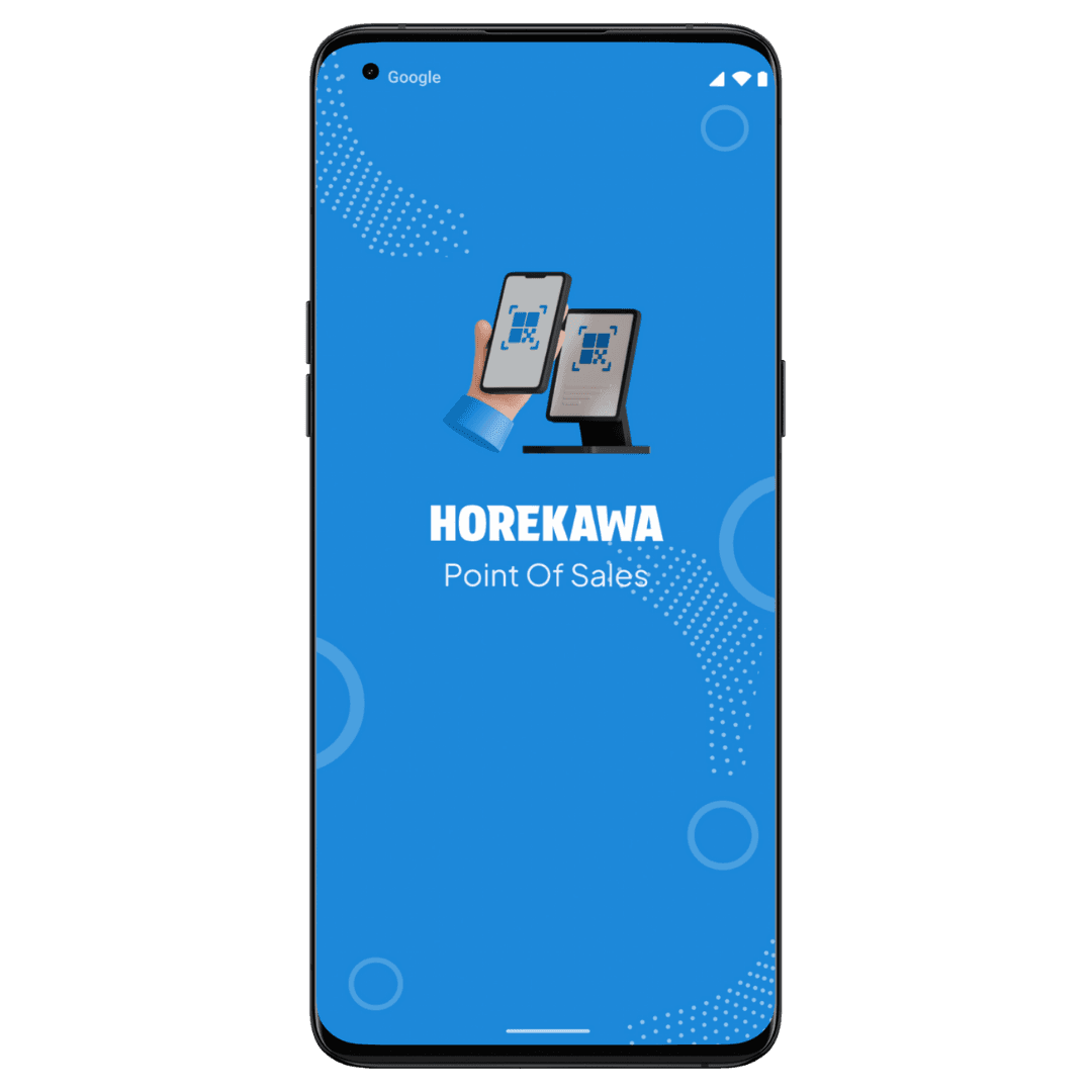
POS
HOREKAWA
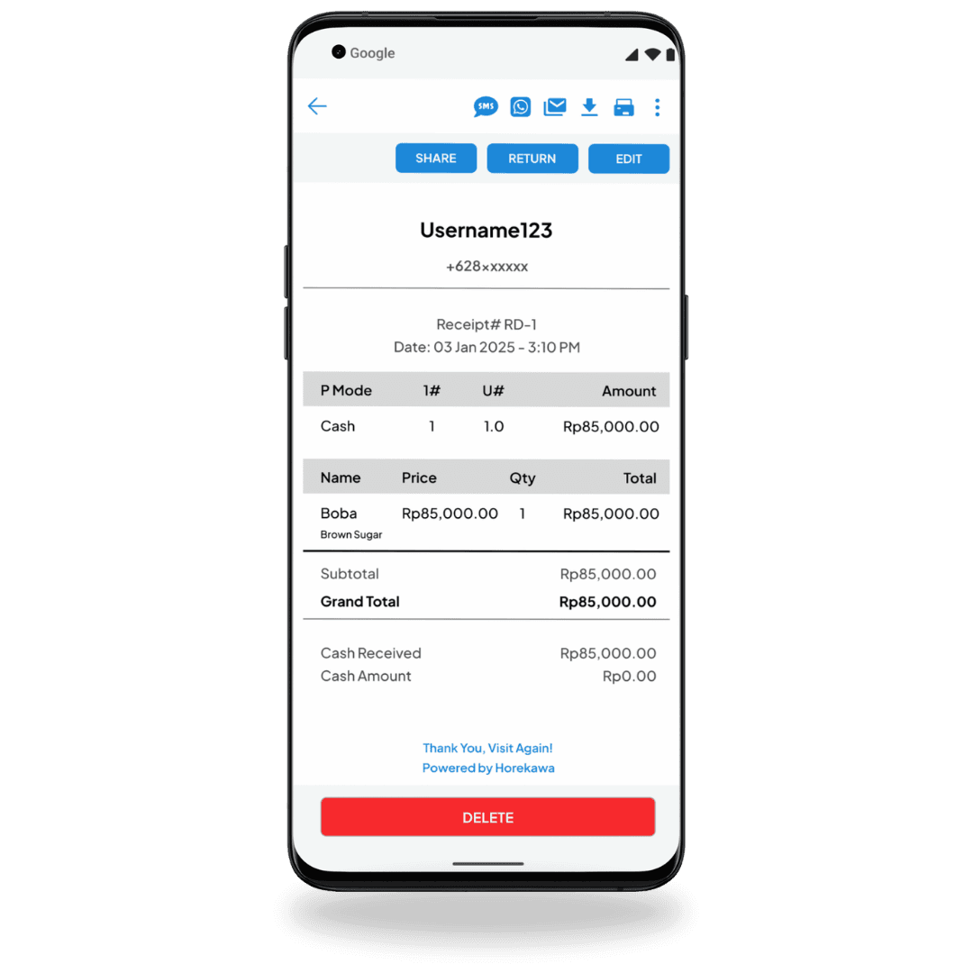
OVERVIEW
HOREKAWA is a Point of Sales (POS) application developed for a store owner who previously managed inventory, procurement, and cashier functions using the ZOBAZE app. The client requested a similar application with an upgraded visual design and user experience (UX), while maintaining the familiar layout and flow from ZOBAZE. The goal was to improve user comfort and interaction while retaining the essential functionality of the original app.
CHALLENGE
The primary challenge was to enhance the visual design and UX of HOREKAWA, transforming the minimal and basic interface of ZOBAZE into a more appealing and user-friendly application. This involved:
Visual Upgrade: Ensuring the color scheme, layout, and design elements were more cohesive and aesthetically pleasing.
UX Improvement: Refining the user flow and interactions to provide a more intuitive and seamless experience for both the store owner and their employees.
Feature Optimization: Evaluating and eliminating redundant features, ensuring each element had a clear purpose and improved usability.
APPROACH
Conducting a comprehensive review of ZOBAZE's features to understand their functions and relevance.
Engaging with the client to gather insights on pain points and preferences, focusing on usability improvements.
Creating a cohesive color palette, adding soft radius to elements, and refining the layout to reduce visual clutter and improve readability.
Developing high-fidelity prototypes to demonstrate the new design and gather feedback before implementation.
Ensure the upgraded design met the client’s expectations and enhanced the overall user experience.
DESIGN PROCESS
The design process began with a deep dive into ZOBAZE's existing structure to understand its strengths and weaknesses. This was followed by crafting a new visual identity for HOREKAWA, focusing on modern aesthetics and user comfort. The process involved wireframing, prototyping, and iterative testing to ensure the design improvements effectively met the client’s needs. The use of soft colors, better spacing, and rounded elements helped make the interface more inviting and user-friendly.
RESULT AND CONCLUSION
The HOREKAWA project is currently in the development stage, with the design nearing completion. The client has provided very positive feedback, expressing satisfaction with 98% of the new visual design and UX improvements. Some additional feature requests were made during the design process, which were incorporated seamlessly. The client's approval of the revamped design underscores the success of this project in creating an improved, easy-to-use POS system that aligns with their vision. The project is on track to deliver a significantly enhanced user experience, setting the stage for a successful launch